I devoured Edward Tufte’s beautifully illustrated books with endless little gasps and ‘ahs’ of excitement and delight.
Here’s the thing: if we want people to decide something, we should present them with evidence.
That evidence can either confuse, frustrate or overwhelm people or – by stripping away every extraneous element – give the gift of understanding. Preventing all sorts of lost opportunities and disasters.
Edward Tufte is Emeritus Professor of Political Science, Statistics and Computer Science at Yale University. He has five absolutely compelling books on information design.
His big design principle is: “Use the least ink to present the most data in the smallest space.” But that doesn’t really capture his genius, which is how he walks the talk, inspiring us to do better.
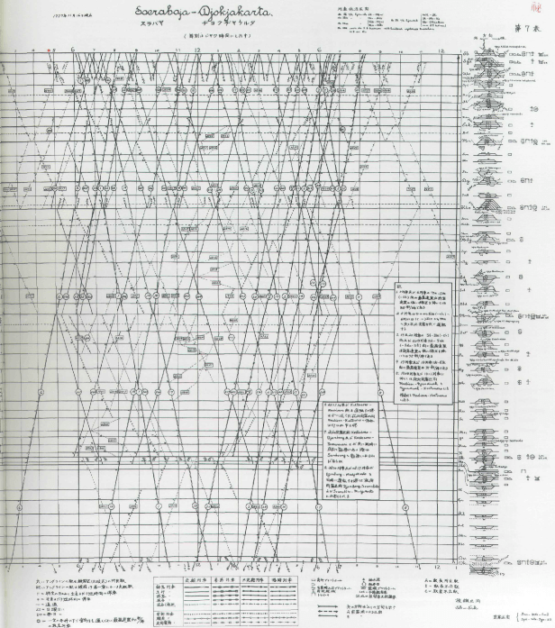
He guides us on a riveting visual journey through Galileo’s notebooks, Stravinsky’s musical notation, Japanese train timetables (amazing!), an anti-slavery campaign poster, Napoleon’s retreat from Moscow, how Powerpoint blew up the Challenger Space Shuttle*, and more. By the end he has completely recast the entire practice of information design.
Think about just one of his rules: “Information should consist of differences that make a difference.” Now imagine applying that systematically every time we create evidence to support a decision. Every significant data variation should be cleanly depicted, and nothing else.
And how’s this for a heading: “Corruption in evidence presentations: effects without causes, cherry-picking, overreaching, chartjunk, and the rage to conclude.” See what I mean.
EVERY communicator should be immersed in this stuff. It’s surely mandatory. After all, everything is decisions, and decisions create the world.
* Did you know that the legendary physicist Richard Feynman sat on the Challenger Space Shuttle disaster board of enquiry? He focused in on just one factor…PowerPoint. He brilliantly showed how NASA’s total reliance on PowerPoint’s dot-lists systematically concealed the hazards and made rational decision-making almost impossible. Yes, PowerPoint kills.
Here are some intriguing images to whet your appetite.
First, how a Japanese newspaper cleverly packs a tremendous amount of weather information into a single easily interpreted image.

This is Tufte’s redesign of a confusing instructional diagram, so the vital information pops out and the images do their job.

This is a famous depiction of the attrition of Napoleaon’s Grand Armée on its journey to and from Moscow in 1812. A complex tragedy rendered into a single breathtaking diagram.

A Japanese train timetable. It blew my mind to see one of these being used by station staff on a recent visit to Japan. It reduces pages and pages of train movements to a single graphic, easily interpreted with a little practice. The vertical axis is stations, the horizontal axis is time. Each diagonal is a single train journey.


